Effective Data Visualization with CesiumJS and Greyscale Basemaps

When visualizing data on a map, clarity is key. Sometimes, less is more, especially when it comes to reducing visual clutter and highlighting the most critical information. In this guide, we'll show how using a greyscale basemap and a simple, focused display can make complex datasets easier to understand. We'll use global fire activity data as an example to demonstrate the benefits of this approach.
Why Simplify the Display?
An effective display reduces distractions and keeps the focus on the key data points, making the insights more impactful. Using a greyscale basemap further enhances visibility by letting the important data, in this case, fire activity, stand out clearly. This approach enhances the effectiveness of data visualization, especially for researchers or anyone working to derive insights from spatial data.
Example Dataset: Global Fire Data
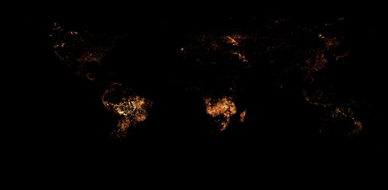
For this demonstration, we use the Terra/Modis Active Fires GeoSpatial dataset from NASA. This dataset provides a comprehensive view of fire activity globally over a one-month period, using colors to indicate different levels of fire intensity. It helps us quickly identify fire hotspots and understand the distribution patterns. Learn more about it here.
The dataset is a single image showing the Earth, with colors like white, orange, and red representing fire activity. White indicates up to 30 fires per 1,000 km² per day, orange shows around 10, and red represents about 1. To make the data more insightful, we need an interactive tool—CesiumJS. Here you can see the raw data as download from NASA's website:

Bringing the Data to Life with CesiumJS
To make this data more meaningful, we'll use CesiumJS, an open-source library for 3D mapping. It helps transform static images into interactive visualizations, providing a much clearer understanding of the data.
Step 1: Loading the Data in CesiumJS
First, we load the data into Cesium using Cesium.SingleTileImageryProvider, which makes it easy to add an image to Cesium's globe. The dataset uses EPSG:4326 projection, which uses standard longitude and latitude.
// Configure the single tile imagery provider
const singleTileProvider = Cesium.SingleTileImageryProvider.fromUrl(
  '/images/fires.png',{
  rectangle: Cesium.Rectangle.fromDegrees(-180, -90, 180, 90)
})
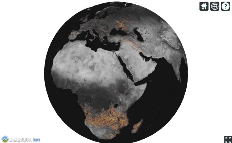
Now, the fire data is displayed on the globe, providing context.
Step 2: Making the Data Stand Out with a Greyscale Basemap
The fire data can be hard to see against a colorful basemap. To make it more visible, we switch to a greyscale basemap, which helps the fire data pop. Greyscale is particularly effective because it reduces visual clutter, allowing the bright fire colors to stand out clearly against the subdued background.
For this example, we use the Keimaps self-hosted satellite greyscale basemap. Which is portable and very easy to deploy as it is a sigle pmtiles files containing all the tiles. You can get the dataset here:
Step 3: Simplify the View
Cesium's default settings include features like the atmosphere, stars, and even the sun and moon. While these features are visually appealing, they can distract from the data we want to emphasize. Let's simplify the view to keep the focus on the fire activity.
// Remove unnecessary visual elements
viewer.scene.skyAtmosphere.atmosphereLightIntensity = 0.0;
viewer.scene.globe.showGroundAtmosphere = false;
viewer.scene.globe.enableLighting = false;

// Remove the sky box, sun, moon, and stars
viewer.scene.skyBox.destroy();
viewer.scene.skyBox = undefined;
viewer.scene.sun.destroy();
viewer.scene.sun = undefined;
viewer.scene.moon.destroy();
viewer.scene.moon = undefined;

// Set the background color to white
viewer.scene.backgroundColor = new Cesium.Color(1.0, 1.0, 1.0, 0.0);
With unnecessary elements removed, the data stands out clearly. We can easily see fire hotspots in Africa and South America, as well as fire activity in the Ukraine war zone.
Wrapping Up
Congratulations! You've successfully created an interactive visualization of global fire activity using CesiumJS. By turning a static dataset into an engaging map with an effective display, we've made it easier to explore and understand fire hotspots around the world.
Using CesiumJS for this visualization has several key benefits:
- Interactivity: The ability to zoom, pan, and explore the globe makes it easier to understand the spatial distribution of fires.
- Effective Display: A greyscale basemap helps the critical data stand out without distractions, making it more effective for analysis.
- Contextual Awareness: Viewing fire activity on a 3D globe provides context that static maps can't offer, making the data more meaningful.
This setup is particularly useful for researchers, educators, or anyone interested in gaining insights into spatial data patterns. With CesiumJS, we bring data stories to life, making them more accessible and impactful. Maps aren't just tools—they're storytellers, and with the right tools, those stories become vivid and insightful.
